Everything you need to show Prompted correctly in articles, decks, partner pages and event material. Use these assets to refer to us, not to suggest we endorse you.
The company and the product are both called Prompted. Our website is promptedbrand.com. Write the name the same way in every language.
Use the files as they are. Don’t redraw, re-space or recolour them. The wordmark is the default; the icon is for small, square spaces.
Prompted is dark first. Ink is the ground, white carries the words, and cyan is the glow that points at what matters.
Each typeface has one job. Mixing them up is the quickest way to make something look off-brand.
The glow is our signature, so it has to stay rare. When everything glows, nothing does.
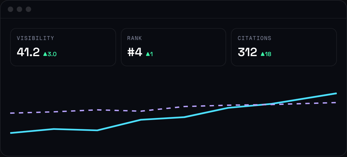
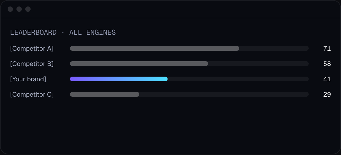
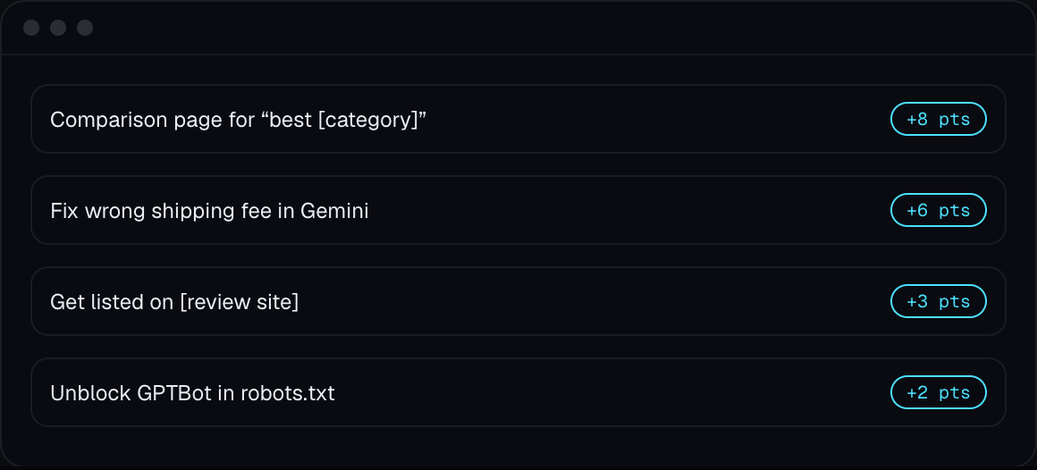
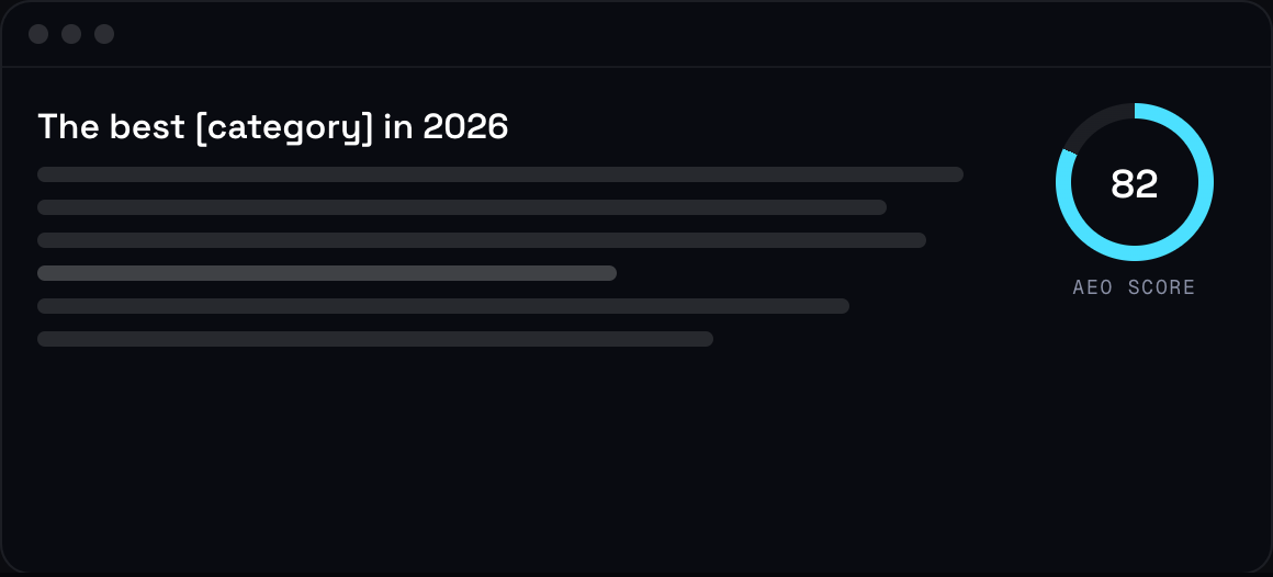
High-resolution screenshots of the main views. Always show them inside a frame with some ink around them, never cropped edge to edge.